
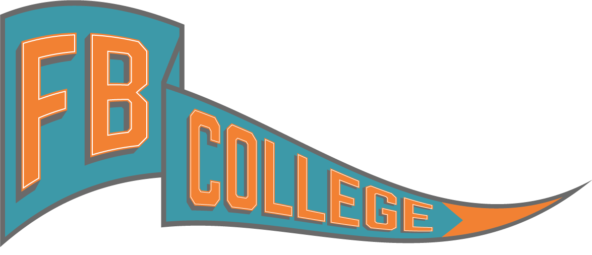
Initial Guidelines
Rebrand “Element” college ministry to FB College Ministry using 2-3 colors from existing color palette. Ideal but not required to include one arrow pointing up and another to the right. The logo should feel very “college”.
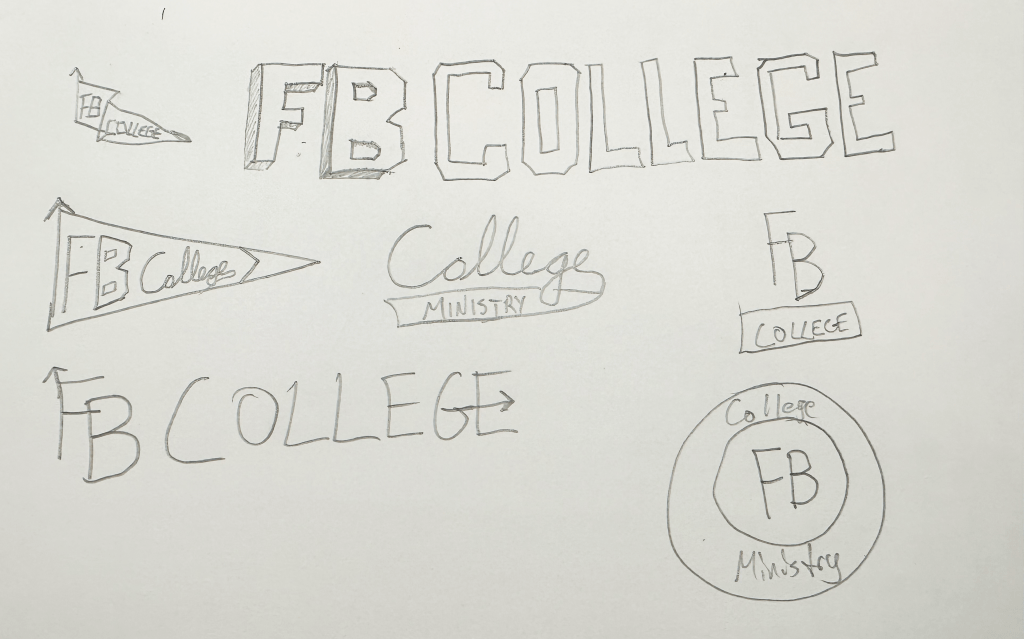
Initial Sketches
Initial Comps


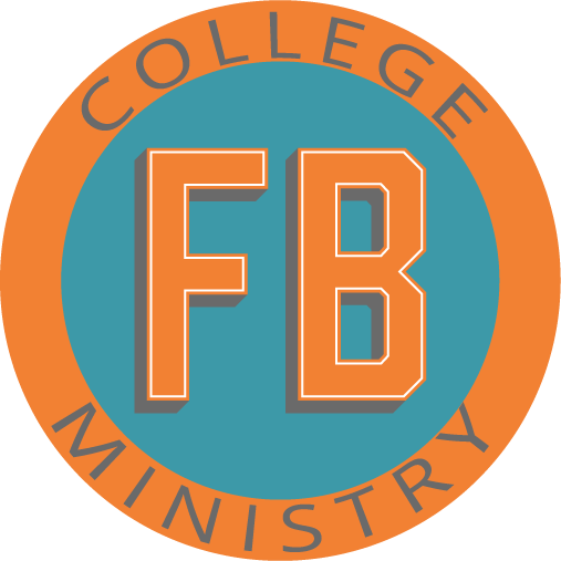

Second Round
Feedback on first round was that all comps other than the last one were “too college-y” and they weren’t sure about the color combo. They also wanted to see about giving the arrows more character. I also wanted to explore keeping the “prohibition” font to see if it would give a more college like feel.
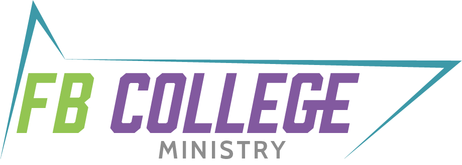
Final Round
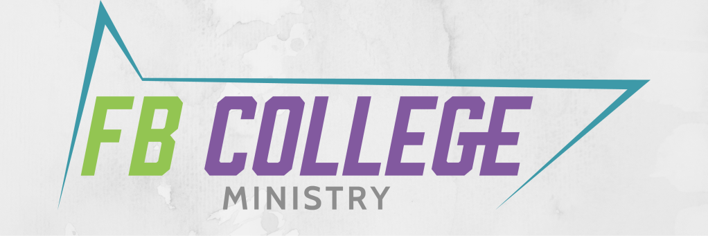
After the second round of edits, the client really liked the idea and look of the angled continuous line. For the final edit, I looked at the difference in the overlapping FB vs. non-overlapping as well as slight shear vs. a 90-degree vertical to give some more motion to the logo.
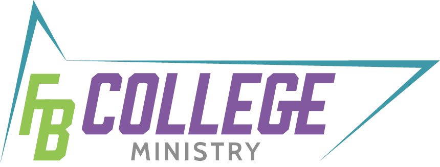
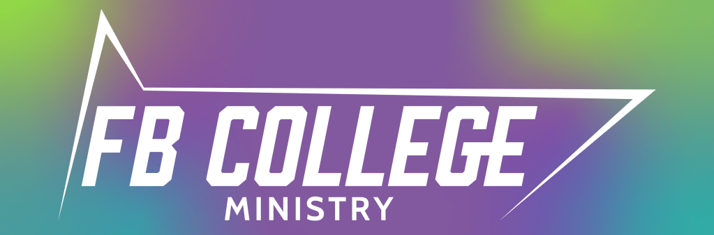
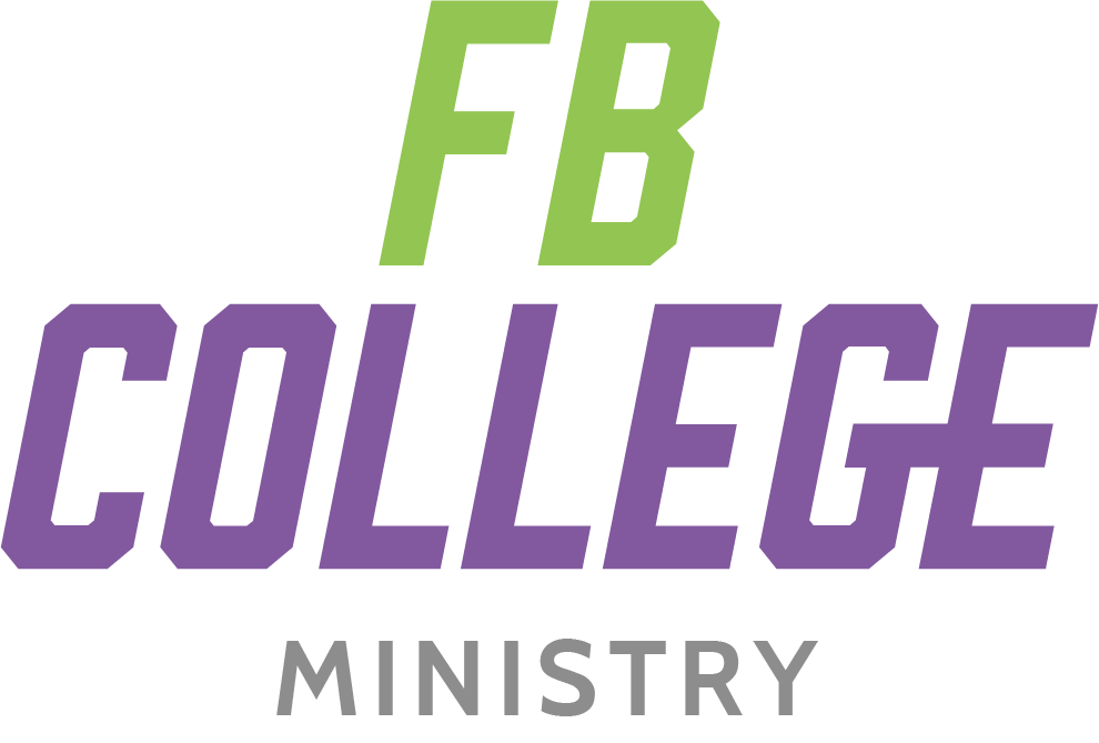
Final Logo & Alternates